SCROLL
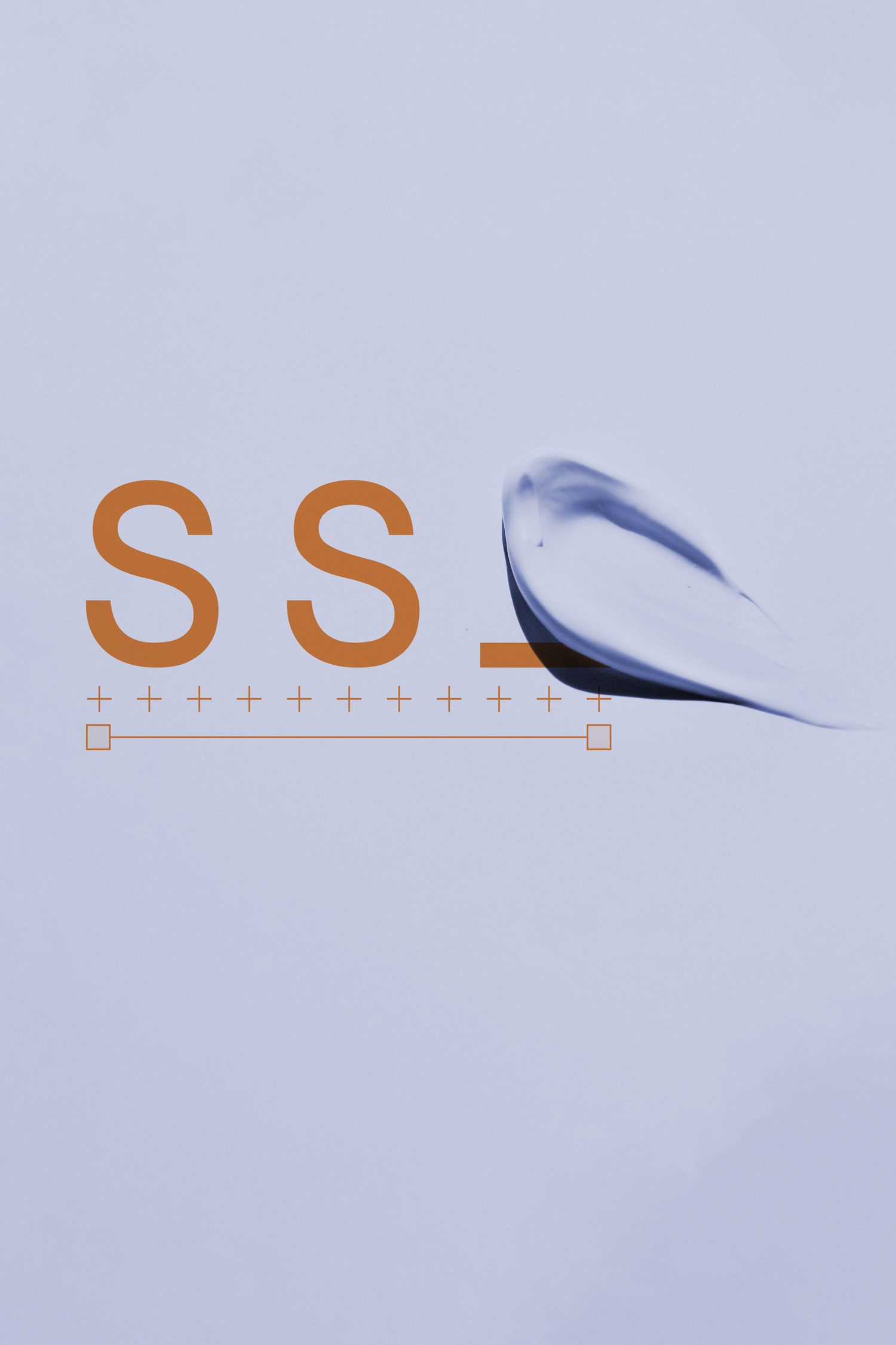
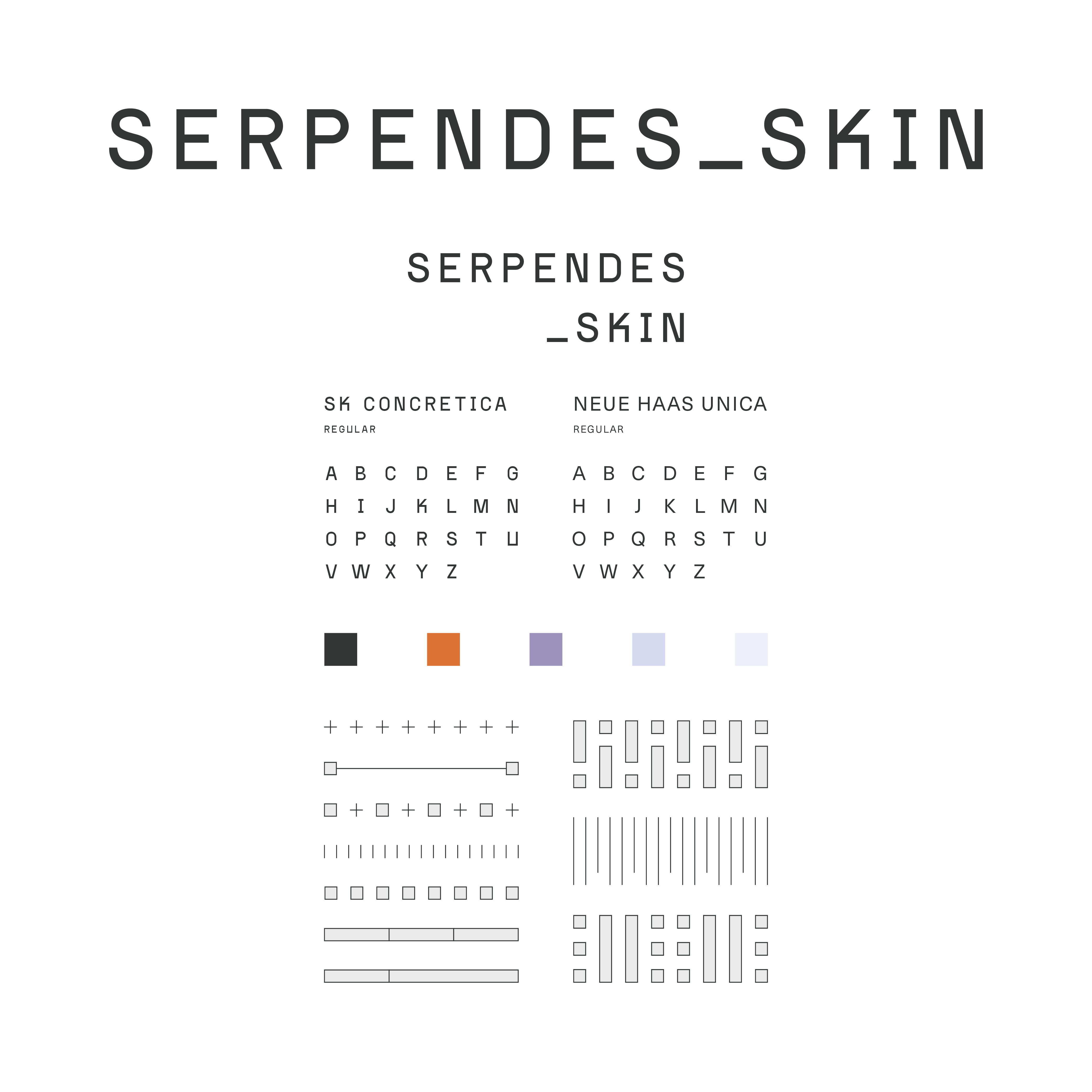
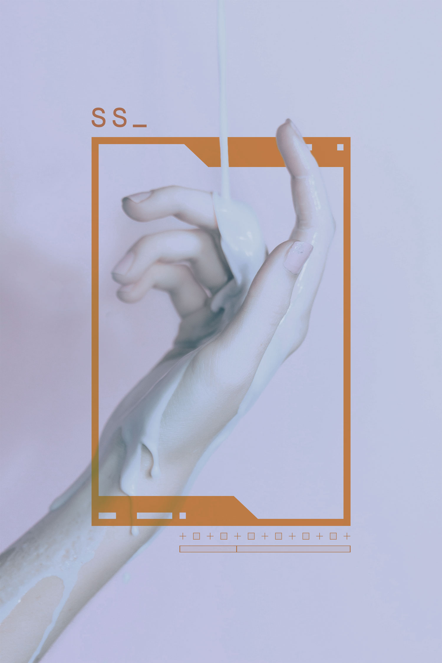
SERPENDES_SKIN
BRANDING | PACKAGING
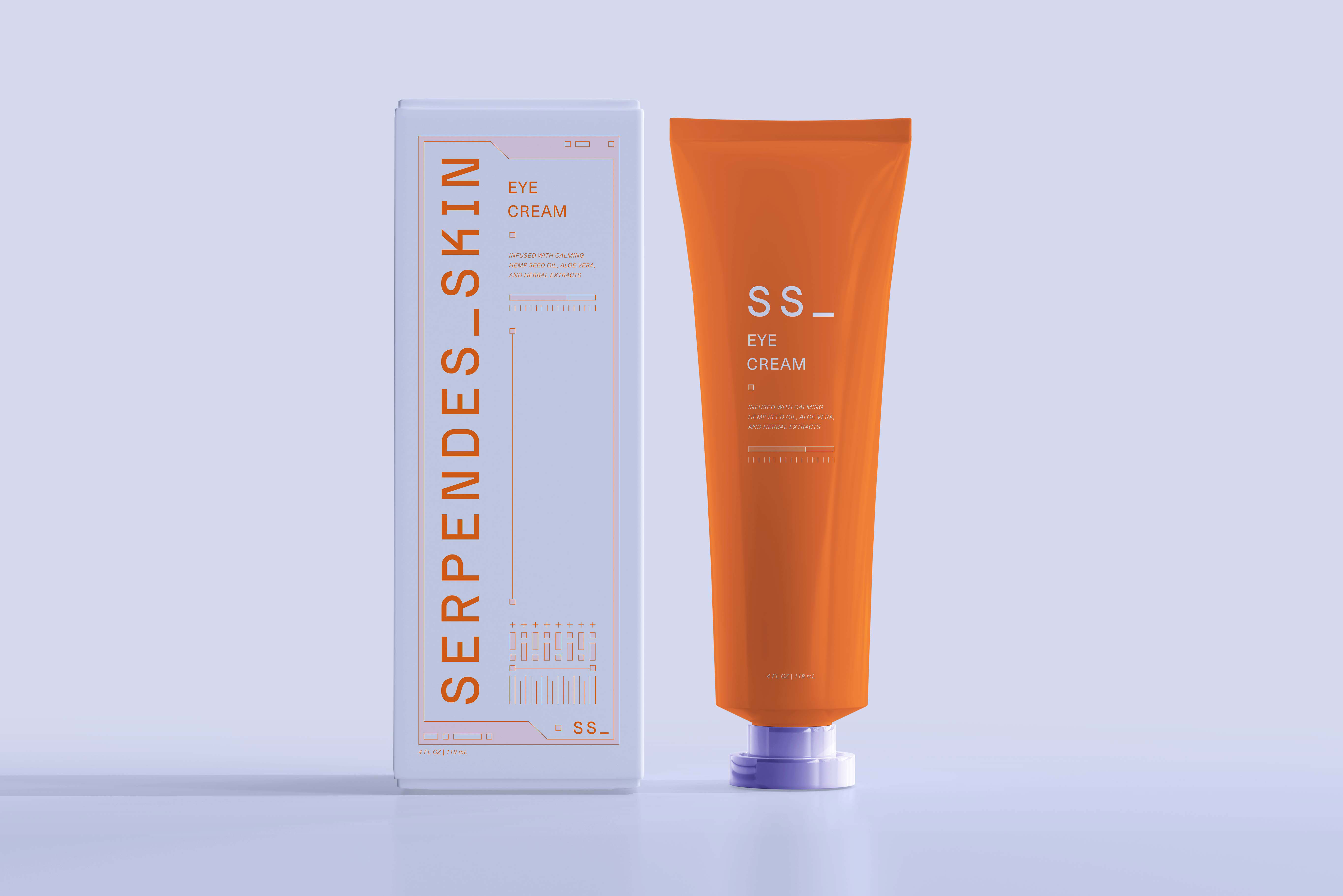
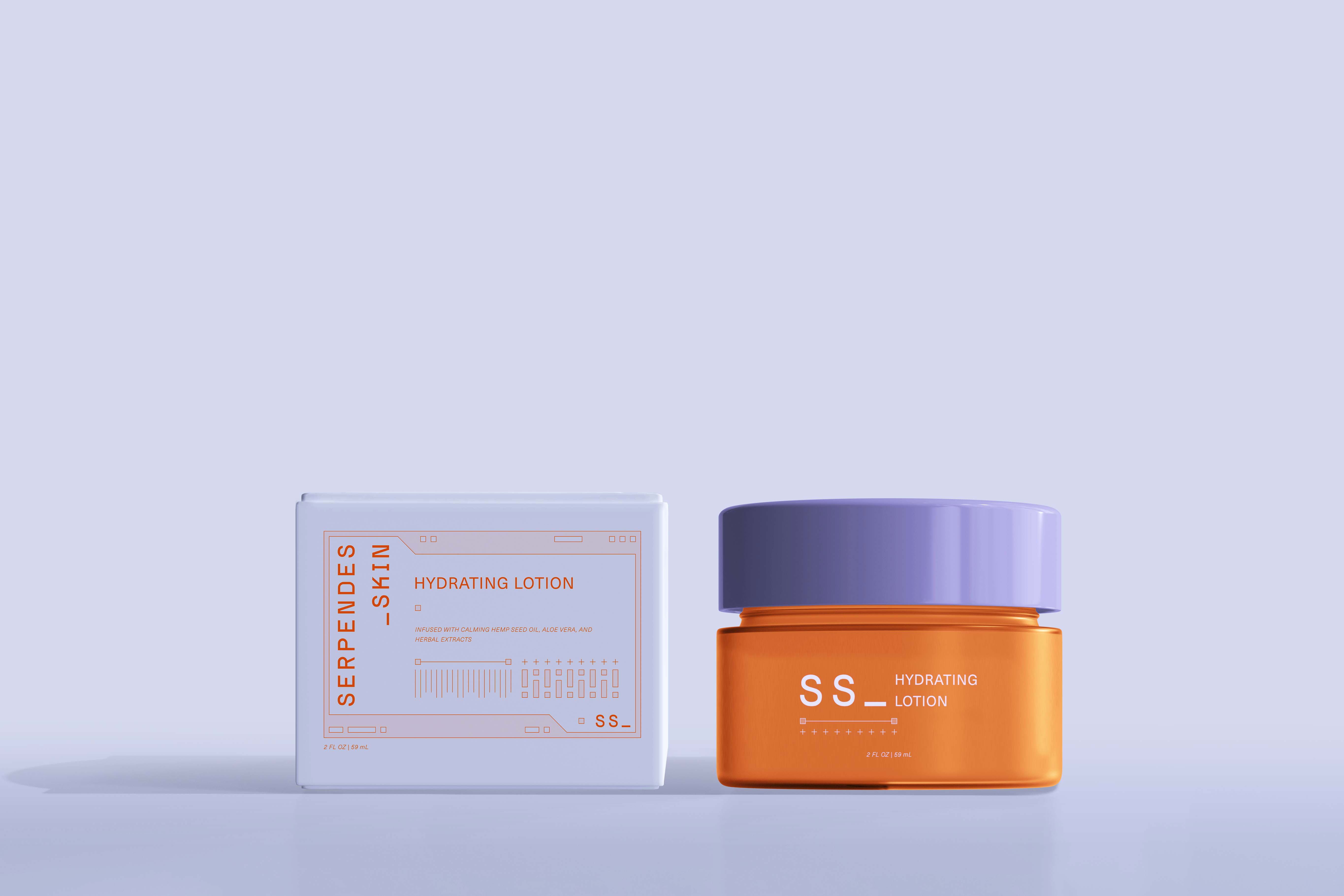
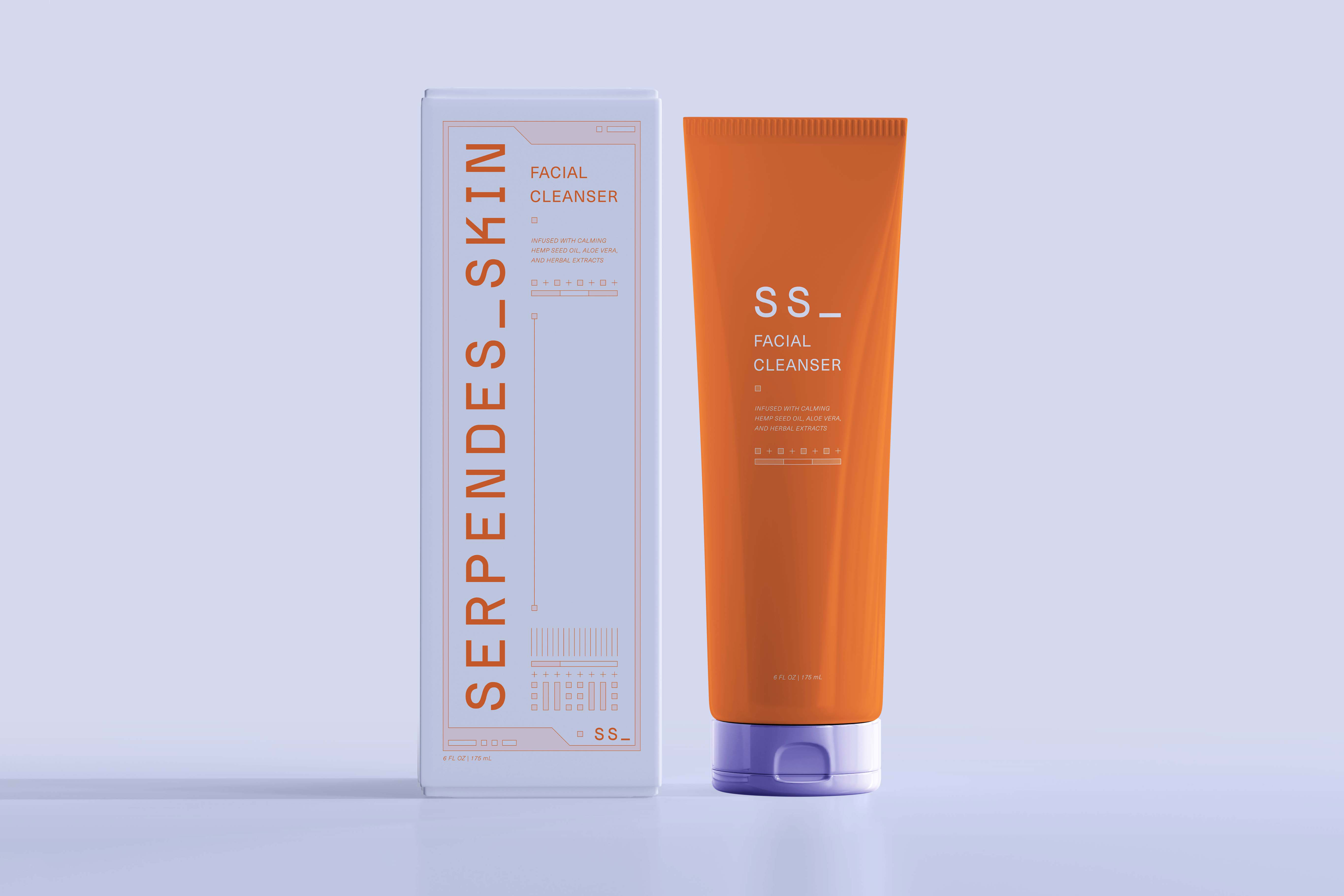
SERPENDES_SKIN is a conceptual skincare brand built around the idea of renewal through simplicity. Inspired by the way snakes shed their skin, the brand promotes clean beauty that supports the natural process of exfoliation, regeneration, and transformation. Each product is formulated to help remove dull, tired layers and reveal smoother, brighter skin—skin that feels as smooth and radiant as freshly revealed skin.
Rooted in a minimalist philosophy, the brand’s visual identity emphasizes clarity and calm, while still embracing bold metaphor. SERPENDES_SKIN is intentionally inclusive, created for all users regardless of skin type, background, or ability.
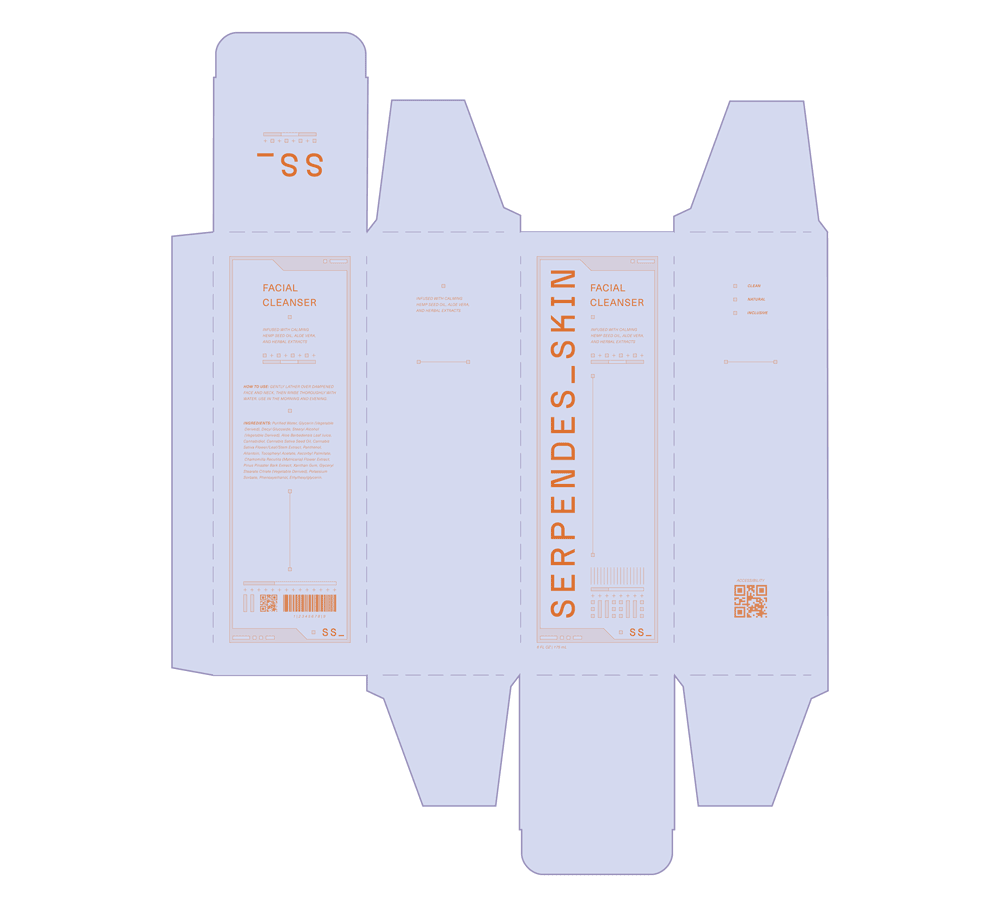
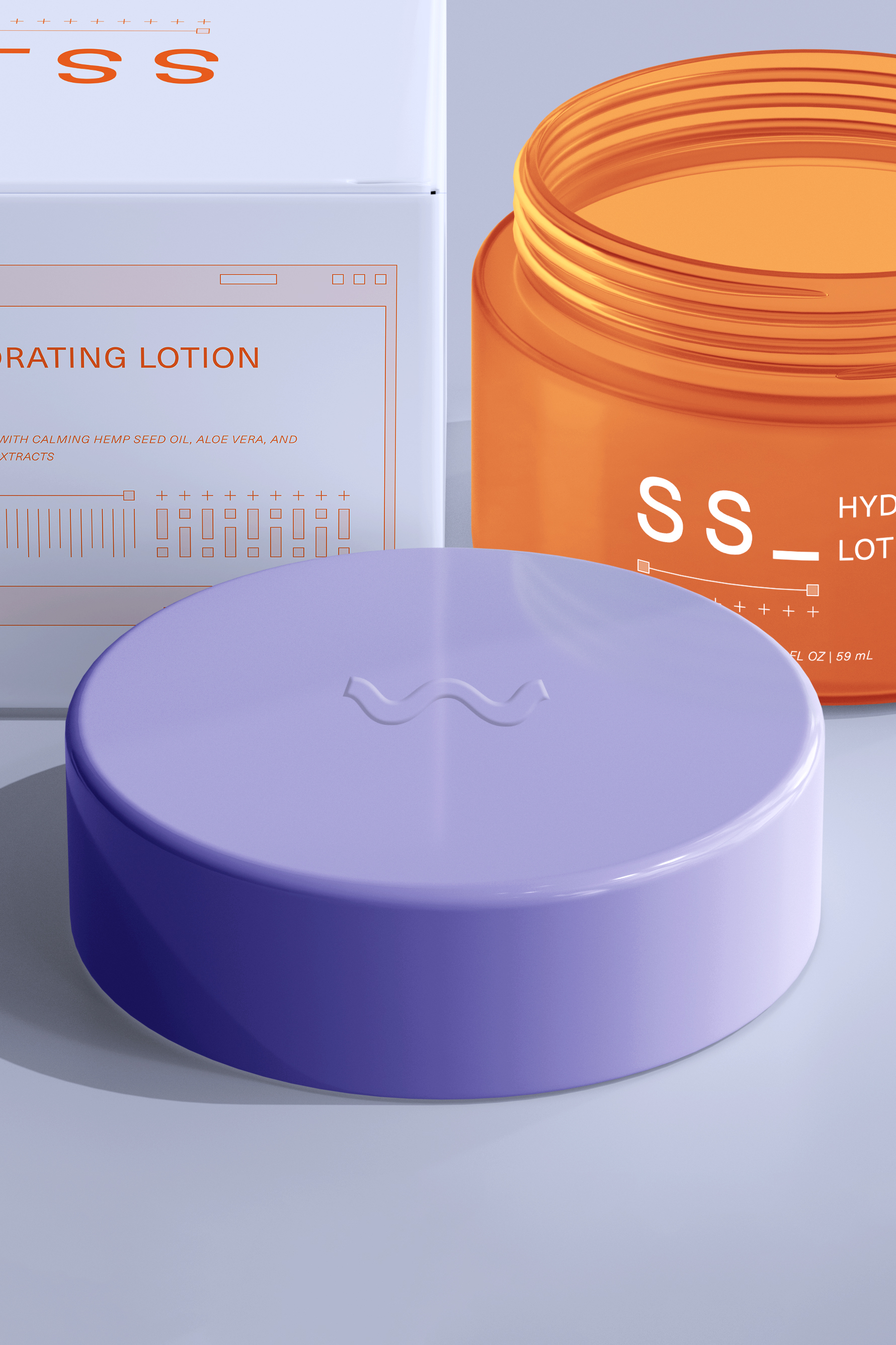
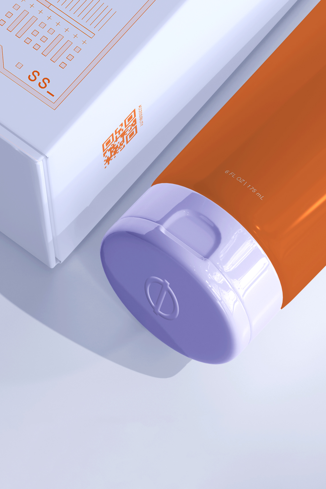
Accessibility is a foundational element of the brand system. The packaging incorporates universal design features, including tactile indicators and use of high color contrast. A key component of this is the CyR.U.S. System, a set of symbology designated for product caps that help distinguish formulas by touch. To further support low-vision users, the packaging uses high-contrast color palettes and clear, legible typography to ensure ease of use and visibility across a range of lighting and ability conditions. More on the CyR.U.S. System can be found here.